Playing with SwiftUI Buttons
The abstractions on SwiftUI are so composable that customising the UI it’s basically an intrinsic property of the framework. Let’s take a quick look at some things you can do with Button.
As per documentation a Button is “A control that performs an action when triggered.. That’s it. A button handles a click interaction for you, including highlighting and focusing. And it adapts the triggering mechanism to the platform.
But the way it looks is just based on what are the contents of the button, and as with other SwiftUI views, it’s up to you to put things on it. In fact, you can’t create a button without giving other views.
Button(action: ...) // nope
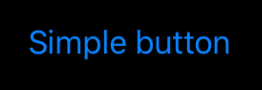
The most simple button is already a composition, you will need a Text.
Button(action: doSomething) {
    Text("Simple button")
}
Keep in mind that the button will adapt to its context, this is a really powerful feature of SwiftUI: Adaptive Views. For example when a button is inside a List it will change is look to behave like a cell.
But for this post let’s look at buttons that are treated as buttons.
You probably want to make a button look like a button, not a floating blue text (sorry Jony). For that you can add a background color.
Button(action: doSomething) {
    Text("Basic button")
}
.background(Color.yellow)

This gives us a nice background color, but careful because there is something wrong here. Let’s explore what it is.
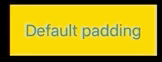
Keep in mind that Text in SwiftUI doesn’t have any intrinsic padding, something crucial to make the layout system work as intended. Let’s add some padding to the button ourselves then.
Button(action: doSomething) {
    Text("Default padding")
}
.padding()
.background(Color.yellow)
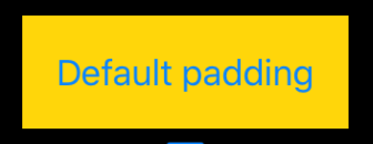
Now we have the default padding, depending on the platform, to our beautiful button. And now is pretty obvious what’s wrong with it:
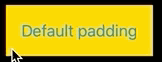
The tap area is wrong!
The problem with our code is that we’re adding the padding and background to the button view, but in reality what that is doing is creating a background view, with padding inside, and the button inside it. The button hasn’t changed, we just have extra views around it.
This is fundamental to understanding SwiftUI. The modifiers don’t change the views, they create new views.
To have the expected behaviour we need to apply our transformations to the content of the button, not the button itself. In this case, to the Text.
Button(action: doSomething) {
    Text("Default padding")
        .padding()
        .background(Color.yellow)
}
Now you can see how no matter where I tap on the background, it reacts as a button. And now you can even see how the background itself changes color when taped.
Take a moment to interiorise this as it’s quite important and different from what we’re use to in UIKit.
Now let’s try to add an icon to our button, something pretty common in Apps. Usually, with a UIKit mentality, you would think on setting some image property on the button. But again, SwiftUI is all about composition, so to add an image you… just add it ¯\(ツ)/¯
Button(action: doSomething) {
    HStack {
        Image(systemName: "rectangle.grid.1x2.fill")
        Text("Button with image")
    }
    .padding()
    .background(Color.yellow)
}
Because we want to apply the padding and background to the entire content we wrap the Text and Image in another view, let’s pick HStack to stack them horizontally. This is how it looks:
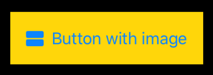
Nice and easy.
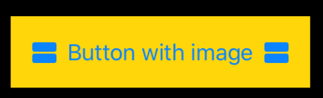
This is something we’re pretty used to do in UIKit, but SwiftUI is much more powerful than this. What if we want an image on each side? Just add another one!
Button(action: doSomething) {
    HStack {
        Image(systemName: "rectangle.grid.1x2.fill")
        Text("Button with image")
        Image(systemName: "rectangle.grid.1x2.fill")
    }
    .padding()
    .background(Color.yellow)
}
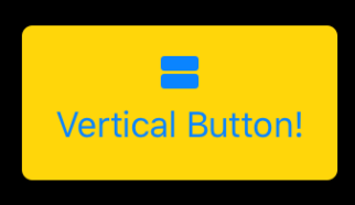
This is already so powerful. But if you’ve been doing app development long enough you will have faced the horror that it’s to make a button with an image on top of the text. There are many way of doing it in UIKit (from playing with insets to making a custom control) but all of them require too much effort. But with SwiftUI is a single line change, replace the HStack for a VStack:
Button(action: doSomething) {
    VStack {
        Image(systemName: "rectangle.grid.1x2.fill")
        Text("Vertical Button!")
    }
    .padding()
    .background(Color.yellow)
}
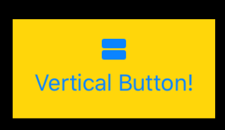
Very nice! The expressiveness and power of this framework is so great! But what’s not so great are those pointy corners. So let’s make them rounded by using another modifier: cornerRadius.
Button(action: doSomething) {
    VStack {
        Image(systemName: "rectangle.grid.1x2.fill")
        Text("Vertical Button!")
    }
    .padding()
    .background(Color.yellow)
    .cornerRadius(5)
}
All of this shows you how nice and easy is to work with SwiftUI and customise its controls. But writing all those modifiers every time we want a button is tedious an error prone.
SwiftUI is supposed to have a ButtonStyle type and .buttonStyle() modifier, but they don’t seem available on the first beta. But we can build our own.
To simplify our lives lets build our own custom modifier.
To start, we need a type that conforms to ViewModifier. This protocol is very similar to View, but instead of returning a view from the computed property, we do it from a function where the framework passes in the existing view we want to modify.
struct MyButtonStyle: ViewModifier {
    func body(content: Content) -> some View {
        content
            .padding()
            .background(Color.yellow)
            .cornerRadius(5)
    }
}
We just use the same modifiers and return the new view.
To use this in conjunction with the rest of the view code, we need to make it nice to use. For that we can just extend the View type and add our own modifier function.
extension View {
    func myButtonStyle() -> some View {
        Modified(content: self, modifier: MyButtonStyle())
    }
}
In it we just create and return a Modified type, which represents a new view by modifying the existing one with our ViewModifier.
With these two simple peaces in place we can now reduce the boilerplate of our code.
Button(action: doSomething) {
    VStack {
        Image(systemName: "rectangle.grid.1x2.fill")
        Text("Vertical Button!")
    }
    .myButtonStyle()
}
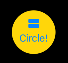
The best thing is that by using this custom modifier we’re not limiting us to this specific customisation. We can keep adding modifications on top of it.
For example, let’s make a circular button!
Button(action: doSomething) {
    VStack {
        Image(systemName: "rectangle.grid.1x2.fill")
        Text("Circle!")
    }
    .myButtonStyle()
    .mask(Circle())
}
Or any other shape that we want!
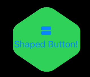
I suspect there are better ways of doing shaped buttons respecting the size of the text. But this works for illustration purposes.
These simple examples show the flexibility and power of SwiftUI. But are also useful to interiorise the differences with UIKit or another traditional UI framework.